Frameplay Company Rebrand
Frameplay is an advertising company that works with clients to run ads within their gaming network. During my tenure, I was given the unique opportunity to lead the company’s rebranding initiative. The intent was to visually align the brand with the industry in which they operate—gaming.
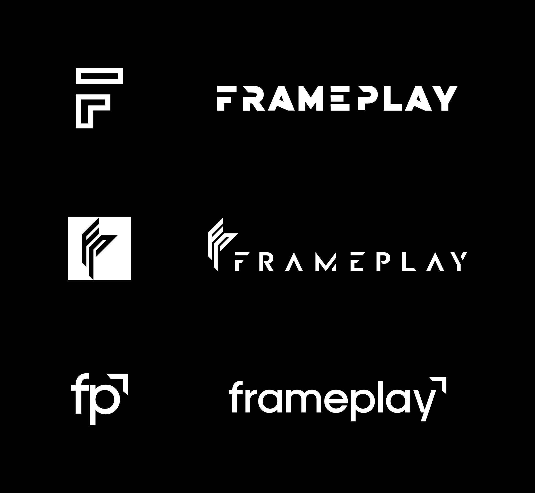
The biggest challenge in the early stages of development was being careful to transfer certain aesthetic principles into the new branding. The original logo was beloved by the company and its founder, so finding a balance between nostalgia for the original and the sharp new direction was paramount.
-
The process began with an initial research and sketching phase. We assessed which abstract shapes and concepts most closely aligned with the intent of the mark, and began to refine. We also began experimenting with the initial color concepts that would follow through into the final execution of the new branding. Presenting and processing feedback from C-Suite stakeholders occurred during each phase of concept development.
The Final Concept: “The Trophy”
The metrics by which a player earns in-game achievements are never explicitly stated within the context of the game, but their presence is felt within the gaming industry. This is also true for Frameplay and its cutting-edge tech. This mark presents Frameplay as one of these intrinsic gaming achievements. This mark is a meta-goal defined outside a game’s parameters; it is an achievement to be desired.
-
This phase of development is when the personality of the completed logo would expand into the entire Frameplay visual system. This included developing the brand book that established the font system, usage of graphic elements, iconography, color family, photography, etc. The Brand Standards solidified the “tone” of Frameplay.
-
The logo was completed and the brand book stood as the new guideline. The final phase was putting the new visual system into practice. Through coordinated team effort, all established company collateral was re-designed to align with the new look.


